 Cyclogram
A cyclogram is the drawing every machine designer ends up making, usually on the back of something: time runs left to right across one repeating machine cycle, every moving part gets its own lane, and every motion of that part is a bar on it.
Read down a vertical line and you see what the whole machine is doing at that instant. Read along one lane and you see one actuator's working day. That is the entire idea, and it answers what no sequence list can: not what happens, but what it costs, and what could happen at the same time.
Cyclogram comes from the Russian циклограмма, and Chinese mechanics courses teach the same chart in linear, rectangular and circular forms. English-speaking machine builders usually say timing chart or timing diagram; the lean side says machine cycle chart; German practice has Funktionsdiagramm and Bewegungsplan.
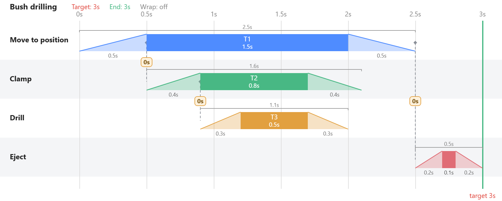
First: which of the two charts do you need?
There are two different drawings, both called timing charts by their owners, and mixing them up is the commonest mistake.
- A step chart puts equally spaced sequence steps along the bottom. It shows order and dependency beautifully and says nothing about duration. It answers what causes what.
- A time chart puts real seconds along the bottom. Bars have width, and the width means something. It answers what costs what.
Both are legitimate; the Festo pneumatics course teaches both forms side by side. But if your question is why the machine makes 900 parts an hour instead of 1,200, only the second can answer it, and a step chart drawn on a time axis is worse than either, because it looks quantitative and is not.
Step 1 — Write the sequence in shorthand first
Before any drawing. The classical pneumatic notation gives each actuator a letter and each stroke a sign — extend +, retract − — so a whole four-stroke cycle collapses to one line:
A+ B+ B− A−
Moves that happen together share a position: A+B+ if the slide and the clamp start together. Notice what the line counts — strokes. A+ and A− are two of those four entries, but on the chart they are the two ends of one bar: out, wait, back. Four strokes become two bars, B's nested inside A's, and making that translation is the first thing Step 4 asks of you.
It takes a minute, and it is the version people will actually argue with. Have the argument before you invest in a drawing.
Step 2 — Decide where each step starts and stops
This separates a chart worth having from a chart full of plausible numbers, and the rule comes from classical time study rather than from controls: every element boundary — a break point — must be something an observer can recognise the same way twice. A machine stopping, a catch releasing, a clamp seating. Not "about when it starts to slow down".
If two engineers timing the same machine disagree, the fault is usually not the stopwatch: the step has no observable edge, so they are honestly measuring two different things.
Step 3 — Find out why each step starts
Here is the part most people skip, and the reason a chart copied off a running machine is often worthless. Eric Allen makes this point at Data Driven Manufacturing: recording the motions you can see documents the symptom. The value is in why each step begins.
For every bar, ask what actually releases it:
- A confirmed position — a proximity switch, a limit switch, an encoder value. The step waits for evidence.
- A timer — the step waits for a number somebody typed, and the machine has no idea whether the motion finished.
- A shaft angle — on a cam machine the step happens at 142°, because that is where the cam says so.
These are three different machines even when they draw identical charts. A timer-released step silently depends on air pressure, temperature, load and wear, all of which drift; a position-released step degrades into a slower cycle instead of a crash. Find a timer holding a safety-relevant overlap together and you have found the most valuable thing this exercise will produce.
Step 4 — Draw motion, not on/off
The bar is travel over time, not a signal state: the lane's bottom line is the start position, the top of the bar is the end of the travel, and the three spans across it are the stroke out, the time held at the end position, and the stroke back. One extend-hold-retract is therefore one bar — a cylinder out in 0.3 s, held 1.2 s and back in 0.3 s is a single trapezoid 1.8 s wide, not three.
Draw on/off bars instead and you lose the only questions that matter: where is everything at 1.7 s, and can these two be in the same place. The trapezoid keeps position in the picture; a rectangle throws it away.
The sloped edge is a straight-line stand-in for the real stroke, which eases in and eases out. Read a position off the middle of a ramp and you are close; off the very start, the real motion has barely moved. That error runs in the safe direction, and it is what buys the clearance in Step 6.
On cam machines the axis is often the master shaft in degrees rather than seconds, because that is what the hardware is synchronised to. Same drawing, different unit — divide by shaft speed and you are back in seconds.
Step 5 — Draw the dependencies, not just the bars
A bar sitting at 2.4 s records a decision. It does not record why it sits there, and next month, when the clamp gets 0.2 s slower, nobody will remember whether it should move.
The rule in practice: for every bar, state what it waits for rather than when it starts. "The drill feeds when the clamp is closed", not "the drill starts at 0.9 s". On paper that is an arrow; in software it should be a live dependency, so that changing one number re-times what follows instead of quietly invalidating the drawing.
That is the whole difference between a picture of a machine and a model of one.
None of which is new, and it is worth knowing why it feels new. In the VDI 3260 function diagram — the German standard for exactly this drawing — signal lines run from the sensor or valve that causes a transition to the motion it starts, so the drawing records the causal wiring and not only the result. VDI 3260 was superseded decades ago, and its descendants (GRAFCET, now IEC 60848) kept the causality and dropped the time axis. It is still what pneumatics courses teach, because nothing replaced it — which is why the chart engineers actually draw has no living standard behind it, and everybody reinvents it.
Step 6 — Now read it
Where the target comes from. Not from the machine — from demand. Takt time is available production time divided by the parts required in it, and your machine must be quicker than that, because nothing runs every minute it is switched on. The design rule is target cycle time = takt × the effectiveness you expect to achieve: a four-second takt at 75% gives a three-second target, and that is the red line on your chart before you draw a single bar.
Cycle time is set by one chain. Follow the dependencies from the start of the cycle to the last thing that finishes: that chain is the critical path, and its length is your cycle time. Everything off that chain can be improved for exactly no gain — the most reliably surprising thing a first cyclogram tells anyone.
The seconds live in the overlaps. A strictly sequential machine is safe, obvious and slow. Ask of every adjacent pair: does this genuinely need the one before it to be finished, or only to be out of the way? That difference is usually worth more than any component upgrade.
And refusing to overlap gets paid for twice, because the target line does not move. What you will not win by overlapping you must win by going faster, and for a given stroke the acceleration rises with the inverse square of the window you allow: halve a motion's window and you have bought four times the inertial force. A sequential machine is billed on both sides — in parts it does not make, and in violence it did not need.
Where the overlap usually is, cheapest first:
- Hide work inside time you are already spending. The pallet changer is the canonical case: one pallet is loaded while the other is cut. Nothing got faster; the work moved into an interval already occupied.
- Start the next motion before the previous one is home. Profiles that begin and end gently, such as cycloidal or modified sine, move almost nothing in the first slice of their window, and that is what buys the clearance. Cam indexer selection guides suggest choosing a longer index period than the motion needs for exactly this reason.
- Shorten a dwell that is long because somebody rounded up.
- Split or duplicate the bottleneck station when the operation truly cannot be compressed. It costs floor space and handling, so it is the last move rather than the first.
And the counterweight, from the same textbooks that tell you to overlap as far as the geometry allows: leave a deliberate gap between the end of one motion and the start of the next. Manufacturing and assembly errors are real, and a clearance that exists only on the drawing is not a clearance.
What a cyclogram will not tell you
Be honest about the edges of the drawing — this is where people get hurt:
- It is design intent, not runtime behaviour. The real machine advances on sensors, and its bars breathe with air pressure, temperature, load and wear. Your chart is the nominal loop.
- The nominal loop is not where crashes happen. They happen recovering from a mid-cycle fault, with everything parked at positions the normal sequence never produces and the interlock reasoning behind an overlap no longer valid. The recovery path deserves its own thought and will not appear here.
- The chart does not know what happens when the power goes. A spring-return valve drives its actuator to a default; a detented double-solenoid valve stays put. Two machines with identical cyclograms behave differently on an emergency stop, and a tightly overlapped one can collide during an uncontrolled stop, because each axis then stops on its own terms.
- A clearance on the chart is not one you have unless the bars include overshoot, the outline of a loaded gripper, and the tolerance you actually hold.
- Anywhere a person can reach, this stops being a timing question and becomes one for risk assessment and the machinery standards.
Doing it in Cyclogram
Cyclogram is this drawing as a live model. Actuators are the lanes, tasks are the trapezoidal bars, and each task exposes four hooks — the two ramp tips and the two body edges. Binding one hook to another, with a signed offset, is Step 5 made live: change a duration and the chain re-times itself in one pass. Cycle time is derived rather than typed.
The next article builds one from an empty screen, explaining the reasoning behind every step: Drilling a bronze bush, step by step.
Sources and further reading
- Eric Allen, "The Machine Cycle", Data Driven Manufacturing — why the reason behind a step matters more than the step.
- Festo Didactic's pneumatics course materials (TP101, Pneumatics Basic Level), for the two diagram forms, the
+/−shorthand — which Festo tags by component,1A+ 2A+ 2A− 1A−— and the VDI 3260 function diagram. - IEC 60848 (GRAFCET / Sequential Function Chart), the formal descendant that kept the causality and dropped the time axis.
- The ILO work study method, for element break points and timing them repeatably.
- Machine Design on cam indexers, for index-versus-dwell arithmetic and deliberately over-specified index periods.
- ISO 12100, ISO 13849-1 and ISO 14119, wherever a person can reach into the motion.